lingo.lol is one of the many independent Mastodon servers you can use to participate in the fediverse.
A place for linguists, philologists, and other lovers of languages.

Server stats:

66
active users

#DataVisualization

2 posts2 participants0 posts today

In this article on illness from Vibrio bacteria along the U.S. east coast (yup, the genus that includes V. cholerae), cartographer @pinakographos pays homage to John Snow's classic cholera map with modern data from Kyle Brumfield. scientificamerican.com/article #dataviz #datavisualization

Direct aerial overhead view of a vibrant teal ocean, sand beach and colorful beach umbrellas.
Scientific American · Vibrio Bacteria in Beach Water Can Make You Seriously IllBy Kyle Brumfield

I recently made a very popular LinkedIn post about Simpson's Paradox, which resulted in an engaging conversation. Paul Julian made a great comment on the relationship between Mixed Effects Models and Simpson's Paradox that I wanted to share with you.

In the plot below (generated from reproducible code – thanks, Paul!), you can see how different models compare:

Original post: linkedin.com/posts/joachim-sch

Further details: eepurl.com/gH6myT

#python #datavisualization
#plotly #technology #industry

Thinking Outside the Box: Top 20 Plotly/Python Code Examples of Amazing Data Visualization That Will Blow Up Your Mind!

Uncovering Hidden Treasures of Plotly’s Interactive Graphics & Apps for Data-Driven Decision-Making (DDDM) across Industries

Example: live global earthquake visualization around Sat, Sep 9, 2023, 12:11 AM (Morocco earthquake) using Plotly EDA.
#exploremore 👇

medium.com/@alexzap922/thinkin

A nice visual exploration of 1,656 conversations: 7+ million words, 850 hours.

"By the end of these conversations, several participants seemed to realize that they may never see their conversation partner again, and had to say their bittersweet goodbyes."

pudding.cool/2025/06/hello-str

Data: science.org/doi/10.1126/sciadv

The Pudding30 minutes with a strangerWatch hundreds of strangers talk for 30 minutes, and track how their moods change

Critical Data Study fresh from the press!

In this contribution to the latest special issue of the Swiss Journal of Sociology, I critically examine how Convolutional Neural Networks can be used to explore historical photo collections. In essence, the writing examines potentials and challenges of human-machine collaboration by juxtaposing human and machine ways of seeing. Clustering 48,000 negatives from the collection Ernst Brunner the analysis reveals how sociotechnical imaginaries in infrastructure act as an epistemological Trojan horse and emphasizes the need for thematic data sets to utilize machine-learning approaches for visual data analysis.

Open Access ➡️ socio-journal.ch/article/view/

Thank you Sebastian W. Hoggenmüller for the great editing, to Kurt Fendt and Tobias Hodel for their critical remarks and to the anonymous reviewers who have given tough but constructive feedback.

www.socio-journal.chThrough the Eyes of the Machine | Swiss Journal of Sociology

Exploring Data Analytics Tools for Data Visualization

Data analytics tools are crucial in transforming raw data into meaningful insights through visualization. Tools like Tableau, Power BI, and Google Data Studio help users create interactive dashboards and charts, making complex data easier to understand.

#DataAnalytics #DataVisualization #BusinessIntelligence #Tableau #PowerBI #GoogleDataStudio #DataScience #DataDriven #AnalyticsTools

Read the full article: pinpdf.com/exploring-data-anal

🌿🌧️ Predicting the extent of invasive Buffelgrass is important for its management. Travis Matlock, a runner-up in the @uazlibraries 2024 #DataVisualization Challenge, in collaboration with the USA NPN, created an informative map that tracks rainfall "events" over a 30-day period to forecast buffelgrass green-up 1–2 weeks in advance. Check out the map here: doi.org/10.25422/azu.data.2570
Travis Matlock (2024). CC-BY 4.0. #OpenData #OpenScience #DataViz #buffelgrass #climatedata #UniversityofArizona

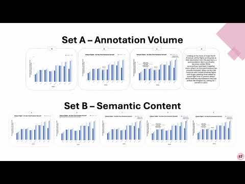
Have you ever wondered how bilingualism shapes reader preferences for annotated charts? Don't miss "Lost in Translation" at #CHI2025 next week ft. Anjana, Chris, and @lace ! youtube.com/watch?v=Nr7DVbjCUo

They'll be presenting at the Visualization and Language Communication track on Weds. April 30th at 10:12am

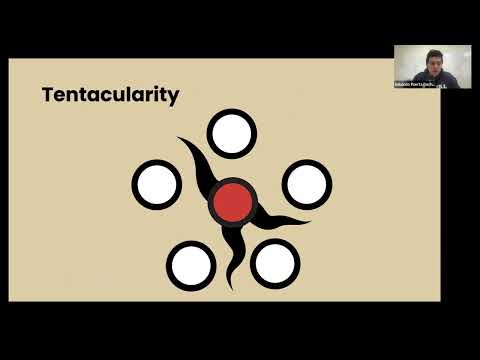
Headed to #CHI2025? Don't miss honorable mention paper "The Many Tendrils of the Octopus Map" by Eduardo Puerta & Shani Spivak (co-first-authors) and Michael Correll @Birdbassador - a retrospective analysis of these visual manifestations of conspiratorial thinking 🐙 youtube.com/watch?v=AyqyTkog_y

Mon, 28 Apr | 12:10 PM - 12:22 PM

@ACM @chi #HCI #DataVisualization #Maps #Mapstodon

🚀 Dive into a GRASS tutorial! 🌟

Discover how to create plots directly in GRASS using tools powered by the matplotlib library. No conversion needed! Visualize your raster, vector, and time series data effortlessly. Check it out and give it a try!

#Tutorial #DataVisualization #GRASS #GIS #Python #Matplotlib

grass-tutorials.osgeo.org/cont

grass-tutorials.osgeo.orgMaking plots with GRASS